Color Psychology and Design: Choosing the Right Palette for Your Project
Have you ever wondered why certain colors are used in logos or marketing materials? Or why do some colors seem to convey specific emotions or messages? The answer lies in the fascinating world of color psychology, a topic that is of great importance for graphic designers.
What is Color Psychology in Design?
Color psychology is the study of how color influences human behavior and emotions. It is a branch of psychology that examines the effects of color on mood, perception, and behavior. In design, color psychology is used to create visual impact, convey messages, and evoke emotions in the viewer.
A color is a powerful tool in design, and it can be used to communicate a variety of messages. For example, warm colors like red, orange, and yellow can evoke feelings of energy, passion, and excitement. Cool colors like blue, green, and purple can create a sense of calm, relaxation, and tranquility.
Why is Color Psychology Important in Design?
Color psychology is essential for graphic designers because it allows them to create designs that resonate with the viewer on an emotional level. By understanding the psychological effects of color, designers can create designs that effectively communicate a message or evoke a particular emotion.
In addition to emotional impact, color can also affect the readability of text and the usability of a design. For example, using light text on a white background can make it difficult to read, while using a high-contrast color scheme can make the text easier to read and more visually appealing.
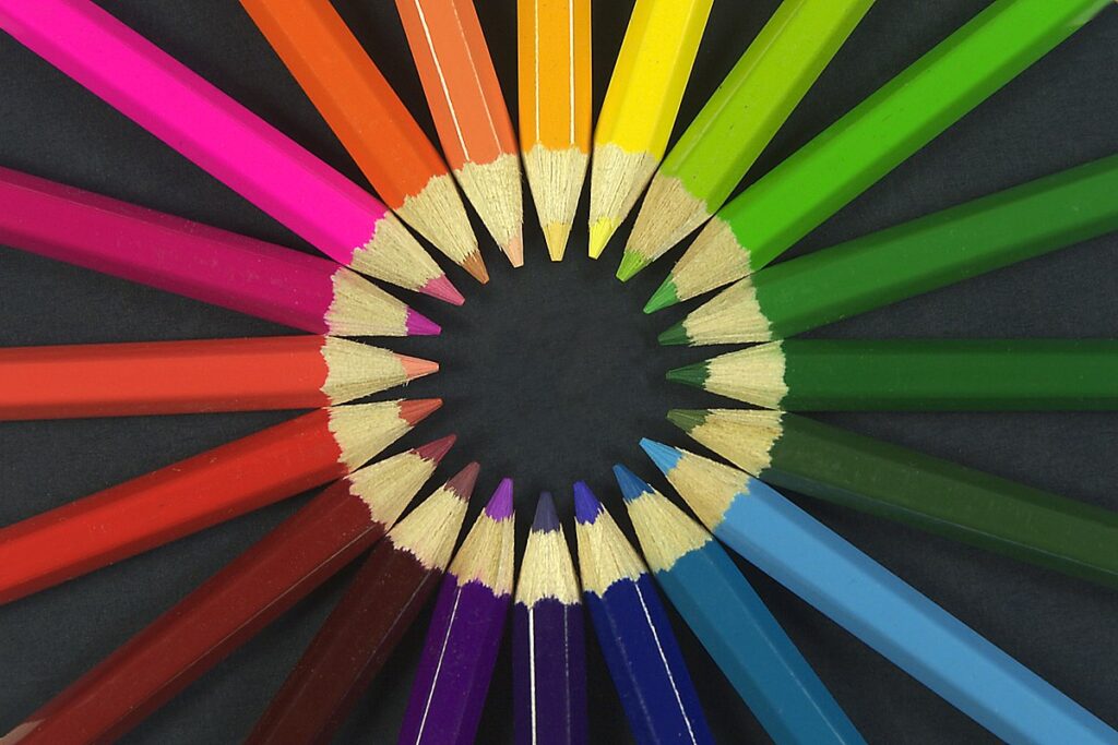
Color Theory for Graphic Designers
To effectively use color in design, it is essential to understand color theory. Color theory is the study of how colors interact with each other and how they can be combined to create a harmonious and visually appealing design.
There are several key principles of color theory that graphic designers should be familiar with, including:
- Hue: the actual color itself (e.g., red, blue, yellow)
- Saturation: the intensity or purity of a color
- Value: the lightness or darkness of a color
- Color harmony: the combination of colors that create a visually pleasing design
By understanding these principles, designers can create color palettes that work well together and effectively communicate a message.
How to Choose the Right Colors for Your Project
When choosing colors for your design project, there are several factors to consider, including:
- Audience: Consider who your audience is and what emotions or messages you want to convey to them. For example, if you are designing a logo for a children’s toy company, you may want to use bright, playful colors that evoke a sense of fun and imagination.
- Branding: If you are creating a design for a brand, it is essential to consider the brand’s existing color palette and ensure that your design is consistent with the brand’s overall identity.
- Contrast: Using high-contrast colors can make your design more visually appealing and easier to read. However, it is essential to ensure that the contrast does not create eye strain or make the design difficult to read.
- Trends: While it is important to create designs that are timeless, it is also essential to stay up-to-date with current color trends and incorporate them into your designs when appropriate.
Final Thoughts: Harnessing the Power of Color Psychology in Your Designs
Color psychology is a powerful tool for graphic designers, and it can be used to create designs that effectively communicate a message or evoke a particular emotion.